Freelance Writing and Design
 When working in a conventional writing career, a writer will generally concentrate solely on writing. Magazines, newspapers and websites have layout artists and graphic designers who handle the design and layout side of the business. Freelancer writers on the other hand, are often expected to have some knowledge in these areas. This is especially true when working on lower budget projects.
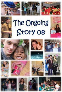
Over the last few years, I have produced two 100 page yearbooks, a poetry book with illustrations, a book of children’s sayings, a visitor’s pack for our church, community carol books and community newsletters. In each case, I have been responsible for the entire package – writing, layout and design. I have Adobe Creative Suite 3 on my computer but I often work with the basic programmes that most people have access to: Word, Publisher and Paint. Have a look at the community newsletter I edit and produce, using Publisher.
Where to Start
If approached to put together a publication, the best place to get ideas is by looking at similar pieces of work. Examine them with a critical eye and assess the impact level, the number of words, the font, justification, graphics placement etc. I started off by doing this and also read several books on design and layout. While there are no hard and fast rules, there are some basic guidelines which will help produce a professional result.
Font and Size
Wherever there are large blocks of text, it is best to use a serif font. Times New Roman, point 12 is the accepted industry standard. Headlines are often set as a sans serif font such as Arial bold. Fancy fonts should be used in moderation and only for things like invitations. A publication full of different fonts always looks amateurish – stick to the basics for a professional effect.
Justification
Pick up any books, magazines or newspapers within reach and have a look at the justification. Most commonly, the text will be justified to the left. In some cases, it may be justified to left and right, producing a neater block of text. The Bible is normally produced in this manner. Centralized text may be used for poetry or advertisements.
Hyphenation
If a word is too long to fit on a line, it may jump to the next line or split into two parts, separated by a hyphen. Novels normally use hyphenation but newspapers and magazines do not. The eye finds it easy to follow a hyphenated word as part of a large body of text, but it looks messy when used in narrow columns such as a newspaper uses.
Graphics and Photos 
Most publications require the insertion of photographs and graphics. Basic editing includes the removal of red eye, cropping, resizing and conversion to grayscale for black and white publications. If you are responsible for choice of pictures, look for something that adds to the story and remember too much detail is not impactful. It is often better to use a closer shot, or one taken from an unusual angle.
The best way to master a computer program is by experimenting. Do this by opening a blank document and designing an advertisement, a book cover or anything you want. Go through the tabs and try each function in the drop down lists. Play with fonts and photographic effects and explore all the possibilities.
A freelance writer with design and layout skills is able to tackle a wider variety of work. Even if you are not artistically minded, it is possible to master the basics. Make it a goal to stretch your abilities this week and you’ll be surprised at how much you can learn by experimenting.


No comments:
Post a Comment